Showing posts with label Paintings. Show all posts

7.28.2012

Mad Tea Party 2012

Some wonderful inspiration... what if there really is a door that leads me to Wonderland! 
A set of keys that opens the door to so many possibilities.

So with a stroke of a brush and some sweet paint I conjured up my own Mad Tea Party!
Swirls of pastel delicacies to share with each and everyone of you!
Im sharing with all of you my very own watercolor painting of a cupcake filled party!
(I have been dreaming of one for a long time!)

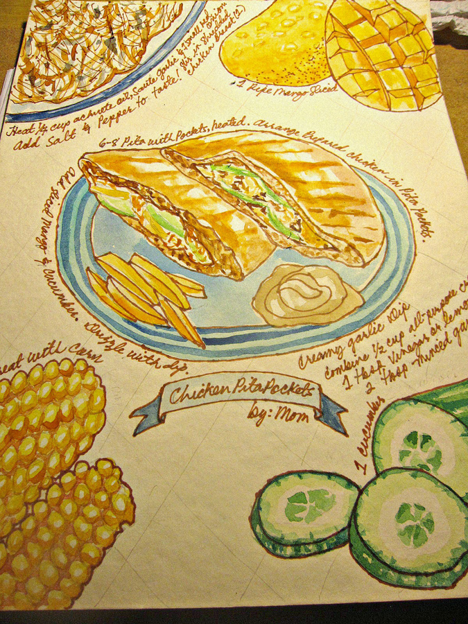
Have some of my mom's pita recipe as well with your cup of coffee or tea!
(check here for how I made this recipe art: 

My last year's party guest arrived late just in time to finish off the cupcakes!

Head on over to A Fanciful Twist for more sweet stuff!
(The first 2 pics on this post are random pics from the internet)


Thanks for stopping by and hope I have satisfied your sweet tooth!

-the weekend artist-

5.01.2012

WOYWW: Mixed Media 'Beach Love' WIP


I'm back for my 2nd week here at WOYWW! I had fun last week!
My desk shows my current project on my mini easle.
It's a mixed media project I am working on with the photo transfer stage already done.  
It is currently on the drying stage after a layer of Liquitex gel medium. 
Once it dries I'll be painting in some more details in acrylic. 
So you see my acrylic paints all laid out and ready once it dries.
I'll post the finished project here over the weekend.
I want to do more projects using this style as well.

How has your week been so far? 
Mine is pretty hectic with all my work deadlines! 
Can't wait for the weekend though and a much needed vacation trip! Yey!
Happy wednesday!

btw, If you don't have an idea what WOYWW is all about do visit Julia over at
http://stamping-ground.blogspot.com/
the brains behind this wonderfully artistic event =)

4.29.2012

the weekend artist series: Food Art #1-01: Recipe Art


Here's the finished Food Recipe Art I have been working on. 
You can find the details of the recipe in the painting but to those 
who want a clearer copy of the recipe here is the one my mom uses:

Chicken Pita Pockets

1. Heat oil(achuete oil 1/4 cup). Saute onions(1 sliced red onion) and garlic. 
Stir in shredded chicken breast(1 chicken breast, shredded). Season and add salt and pepper
2. Dip: combine 1/2 cup all-purpose cream, 1 tbsp vinegar or lemon, 2 tbsp garlic(minced)
3. Assemble prepared chicken into heated pita pocket. Place mango slices and cucumber(seeded and sliced). Add a drizzle of Garlic dip.


It's quite a healthy alternative snack or even meal 
because it is quite filling specially with corn.

I also dedicate this post to my friends over at the 
FOOD REVO PHILIPPINES in support of their crusade for healthier eating. 

Do stop over and like their page to get more details for the MAY 19th event. 
My dear friend joanie aka THE ARTIST CHEF is the Philippines Ambassador. 
Do check out her page as well.

Food Revo Philippines FB fanpage:
The Artist Chef:

going back to my artwork...here are some progress shots:

I used watercolor for the fill and used Letraset Tria for the outlines.
I finished it with a metallic spray to create a 'vintage' look.
I had fun doing this artwork and will go out today 
to have it framed for my mom's kitchen.

have a great weekend!
-the weekend artist-

4.24.2012

What's On Your Workdesk Wednesday: WIP food recipe art


So here's my first post for What's On Your Workdesk Wednesday. 
Here's my desk and the WIP project I am working on 
inspired by Mom's healthy recipe(yum!). 

Here's a sneak peak of the food recipe art I'm working on.

do check out all the other wonderful desks this wednesday! 

have a great wednesday!
-the weekend artist-

3.02.2012

the weekend artist inspiration #9 Museum Eye Candy

I start off with a painting I adore specially the play of colors.
If I remember right this is a Renoir!

My visit to the Boston Museum of Fine Arts opened a lot of new insights for me on
how my taste for certain paintings have evolved through the years.

Another painting which I love specially the stroke/style of painting with colors.

Another piece in a similar style which I think came as a series.

Last but not the least one of my favorites again from a series.

I guess this shows my gravitation towards colors and a certain painting style.
Though nowadays I am also drawn to subdued and saturated style of painting.
It might be a reflection of my current state of mind or as they say 'Art imitates Life'.

I tend to be so serious lately it kind of feels so dramatic.
A better...happier post maybe next time.

goodbye for now...from my boston files
-the weekend artist-


2.10.2012

the weekend artist inspiration #8 Art Appreciation

Stepping inside an art museum is one of my most fave things. Actually any museum gets me feeling giddy inside. I think my love for things old and new (goes to show why it's hard for me to throw things away) and the history that comes with it is hard to resist. 

On a sunny winter day my sister and I dressed in our short dresses and knits to keep us warm went out for a day at The Boston Museum of Fine Arts.
It was hard not to smile and get all excited when I browsed the list of what's in-store(I'll post my fave artworks in my next entry).


A blurred version of me. =)
My little sister appreciating a work of art.

 Students sketching the modern tower art piece.


The highlight of the trip was seeing Degas in the Nude works
(here is another version of a blurred me again.)

Thanks to my sister for a wonderful and memorable day. 
We finally did it(the whole art app day with the outfit)! I miss you dearly!

Goodbye for now Boston!
TWA


8.12.2011

the weekend artist fave art materials


1. Scout Books

I love paper and notebooks am always on the lookout for new stuff when I go out.
 I got my first Scout Book(sketchbook) through the 'Sketchbook Project'. 
It's been with me for sometime now(though I still haven't uploaded progress 
on my book yet...soon!) I didn't notice the branding until the other week. 
I actually was salivating on a set a few months back and was deciding 
if I would buy a set or not. It's a practical size and easy to carry 
plus the paper feels good. They have tons of options for covers.
Though this comes on 2nd to my top fave brand Moleskine!


2. Le Franc and Bourgeois Watercolor Varnish

I was actually on the look-out for a protective mask or spray for my watercolor artworks when I found the Le Franc and Bourgeois Watercolor Varnish. I used it as a finishing touch for my paintings.
It provides a protective layer. I only spread it thinly so that it won't get shiny.


So there so far are my current fave new art material finds. Am always on the scout for more and will post them soon!


6.12.2011

the weekend artist big idea #1: Staring into the Sky

The Weekend Artist Big Idea #1: Staring into the Sky

This is a Mosaic piece which I did ages ago. I used tiles , stones and paint. It was quite a feat since the items I used were quite hard to handle. Painting, glueing and even smashing the tiles was time consuming as well as hard handling because you can get cuts from the pieces.

I was inspired by three things doing this art piece: 1-a wall rug hanging from my room when I was little which I also love staring into. 2- van gogh's starry night painting and 3-the little prince book.


It wasn't actually me who had the BIG IDEA but my mom who decided rather than letting my artwork just sit there turn it into a coffeetable(the artpiece is quite heavy btw).
It now sits in our living room area. So it's actually a conversation piece when people come over. We usually place candles on top of it. So thanks mom for that Big Idea!

Ya me despido!
-the weekend artist-


6.10.2011

the weekend artist series #1-01 The Purple Balloon

Here's the final painting which I edited digitally since it didn't turn out as I hope it would. It's an inspiration piece since the subject is my nephew who is celebrating his 4th birthday this month. I haven't seen him for a long-time since my sister and her family lives in Los Angeles. I miss him terribly.  I was quite frustrated with the outcome because I think he is way cuter in person. 

___________________

Some exciting news I signed up for a project which I'll post some details on soon(check out my twitter page to know more).

6.05.2011

the weekend artist series #1-01 progression 1/2


Finished the weekend artist series #1-01 painting in watercolor. I still call this progression 1/2 since I still want to do additional tweaking via Photoshop. I consider this as a quite crude effort at watercolor =b. I still need more practice to return to my old style(I mean working faster and creating smoother strokes) mixed in with my new style which I am still trying to figure out what exactly.


For this first watercolor post I used multiple colors to make it more whimsical(because of the subject). I also ended up revising my initial thumbnail sketch in the painting process.


*note:This is not an instructional process. I merely am sharing my painting process and in no way am a I saying Im an expert on this.


I used Montval Torchon by Canson paper in 270 g. 9 1/4" x 12 1/2" for this painting. Its paper is grainy with "snowy" surface. I bought it at a local bookstore a long-time ago so I forgot how much it costs.

I wasn't able to take a picture of the brushes I used but I used 3 brush sizes for this. A size 0, size 2 sable Nakamura tokyo brushes and size 6 Prang brush for the washes(the one that comes with the pans).
I used my ever reliable Prang Watercolor. I have been using Prang since I started painting from the and am planning to try a new more expensive brand for my more special paintings(still haven't bought one though still trying to convince my wallet it's really worth it!) 
I did not stretch or tone the paper I used before painting.. though I did set out preparing the materials. Well I thought the paper was hard enough to absorb the watercolor. I was wrong it did a bit of warping. So I guess if you plan to use the same paper you should stretch or tone the paper first. I still have enough of this paper for 8-10 paintings so I plan to stretce them all.

Stretching and toning is important to ensure that the paper stays flat when you are painting.

I bought this book AN INTRODUCTION TO WATERCOLOUR which also explains the whole stretching and toning process.
It costs around US$2.50 quite a cheap find for me. Its sold at our local bookstore(National Bookstore).

I'll run through the stretching and toning process a bit...
You need the ff for stretching:
sponge(I use make-up sponge but the bigger sponges are better)
gum strip(I bought mine from National Bookstore)
plywood or chip board(I use old plywoods but am planning to buy a big fibreboard/clipboard from Saizen the japanese store which costs around US 2.00 or less)

1. Prepare the gum strips. Wet your sheet thoroughly with cold water to allow fibres to expand.
2. Make sure whole sheet is uniformly damp using your moist sponge. Once the paper is damp , moisten your gum strips lightly.
3. With wetted gum strip paper mount your paper on your drawing board/plywood with the gum strips on all 4 sides.
4. Let the paper dry and speed it up by using a hair dryer(I am quite impatient so I almost always use a hairdryer)

for toning paper:
you do the same process except you use diluted acrylic paint(with color of your choice) and instead of sponge use a thick wash brush

I actually didn't do a comprehensive sketch for this one I merely painted by whim. I did do another step though that I want to share. I almost always do a draft of where I want to place the elements of my painting on tracing paper. It helps me plan where I want to place the elements of my painting and move it around my canvass. Once I have finalized it I trace it on the back and retrace it on the canvass where I want to place the element. I sometimes even use multiple tracing papers to achieve my desired composition.
This technique can also be used by people who are not very confident with their sketching skills to get their proportions right by merely tracing an image they took from a photo or elsewhere.

I still think doing a comprehensive sketch is the best technique.

The next step which I skipped for this painting is making a gradient test of your mixed colors/washes. I usually do a gradiation of washes on the same paper which i refer to during the painting process. But since I used multiple colors I skipped this one.
This is the halfway finished painting. I replaced some of the stars with papercranes to give a more whimsical approach.

Another technique I use during painting is not going through the usual route of building with the palest wash then going darker. I usually start with the darkest then go back to the palest. I almost always leave the palest part blank(paper color). So for this painting I started with the eyes.
The eyes I think is the most important when painting faces. If you get the eyes right it almost always looks realistic and looks like the person so I put all my best efforts for the eyes.

That wraps up the whole process. Am still thinking of tweaking the cheeks a bit though coz I want him plumper to show a younger age. I might use a watercolor varnish to protect the painting before I send it out.

-the weekend artist-


6.04.2011

the weekend artist series #1-01 work in progress


I finally got started on something worth posting though only 1/3 done or even less. It's the 1st of the weekend series #1 with the theme inspirations in my life. I'll go into details when I am done with the painting about the subject of my first painting and also the process I went through including materials used.


This is my worktable...a bit crowded specially if Im using my laptop. Was still doing some paper painting for my nephews when I took this picture. Also on top of the table is my new book.

Its Art by Robert Cunning. I like it because it's an art history book but very compact and easy to carry anywhere specially when traveling. I can just read snippets from certain timelines and be easily inspired. 
 I think I picked it about 3 times on 3 different trips before buying it. I bought it from a local bookstore(National Bookstore in Robinsons Galleria). It only costs around US $18.00.
I leave you with a painting by Alphonse Mucha, Czech painter/designer who settled in Paris. I love his style and might just do a whole post about his works in the future.

-the weekend artist-

6.03.2011

What is 'the weekend artist' all about?

Hello artworld! This is a personal art blog which I started to help me search and find my personal artistic stamp in this world. my current work though in the related field has in a way hindered me from doing what I initially loved to do which is paint, sketch and do crafts project. I'll aim to post at least 1 project done weekly or bi-monthly if it's a bigger project.

I'll be posting by categories as well...
1. the weekend artist series- I plan to post artworks pieces inspired in series with a big umbrella theme.
2. the weekend artist big idea- a one-shot artwork which may or may not evolve to a series
3. the weekend artist crafty case- craft ideas or projects that solves or answers a certain dilemma(in my own personal craft world)
4. the weekend artist daily inspiration- may also be weekly or whenever I please...these cover postings of other artists works, daily photographic inspiration, people i look up to, gadgets or whatever under the sun that inspires me.

hope this blog will at least inspire 1 person to eventually pursue their artistic inclinations to a higher level like I am aiming to push myself to do.---the artist

before i go to sleep i leave you with this tipsy sunset photo of me on the waikiki beach. this photo certainly inpires me to pursue my love for the arts wherever it leads me.